
Six ways to represent results graphically with webQDA
By: Sonia Verdugo (University of Salamanca)
The visual representation of results offers the researcher the possibility to show, graphically, the products of their study.
When researching and implementing data analysis and interpretation, dissemination of results, writing of the report, etc., visual models are a tool and a powerful strategy for a direct communication a representation of the data, which allows researchers, and other readers of the study, visualize what one wishes to express.
As Martí & Pozo (2000) indicate, graphic representation is another way of understanding reality. Visual media are a way of supporting the written word (Banks, 2010). The ideal selection of data to be shared and its visualization mean that the communication does not have to be directly explicit (Willers, 2015). It should be noted that the correct visualization of the data is related to the learning of the concepts (Sedrakyan, Mannens & Verbert, 2019). Furthermore, as pointed out by Pértega & Pita (2001), it is essential that the visual means used are clear and adequate, for the correct interpretation of the results, as well as their understanding. In this sense, Friel, Curcio & Bright (2001) present four critical factors that interfere in graphic comprehension: the objective of using graphics and the characteristics of the task, the subject and the reader. And, as Kosslyn (2012) indicates, sometimes the visual means, the graphics, do not communicate effectively, because the goals, needs and abilities of the readers are not taken into account. For all these reasons, CAQDAS, such as webQDA, are important as they assist the researcher in these tasks (Rodrigues, Costa & Moreira, 2019).
Currently, webQDA – qualitative data analysis software allows graphical presentation of sources, coding and questioning of the project on which the software is being used. For this, webQDA currently provides: code maps, density maps, pie charts, bar charts, concept maps and word clouds.
From the coding of the project in webQDA, it is possible to create code maps and density maps.
Code maps provide a branched view of the categories, while density maps reveal a view into sectors according to the organization of defined categories and subcategories.
This can be done using free codes, tree codes and descriptors.
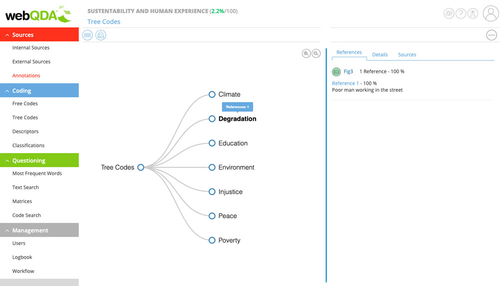
1 – Code Map
First, open the desired tab in Coding. Then, the code or density map is selected.
Later, and showing the example with tree codes, you can create the code map and the density map. As seen in the code map, a branched structure is created.
2 – Density Map
On the other hand, the density map, in this case, offers the researcher the possibility to visually represent the categories of the project, in sectors. The sectors are formed in relation to the existing subcategories, so you can move from the upper to the lower category or vice versa.
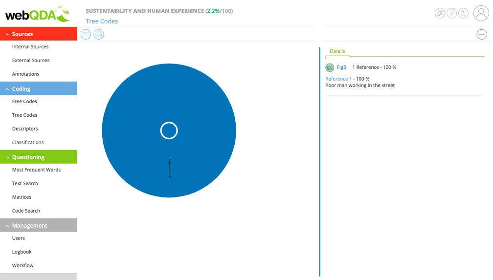
When selecting any of the categories, the program shows how many references are in it. This means that you can access content that has been encoded. In addition, being a dynamic visual model, you can access one of the lowest rated categories and return to the most far reaching category.
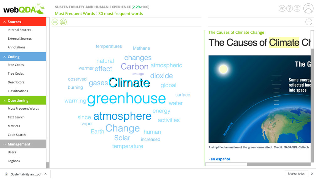
3 – Word Cloud
Finally, a way to visualize the most repeated words in the project is to create a word cloud, by searching for the most frequent words, using the Questioning option. This option also offers the possibility to choose the number of words and number of characters.
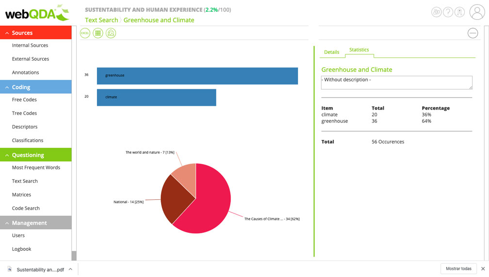
4 – Bar Graphs and Pie Charts
On the other hand, if what you need is to represent a text search, that is, a term and see where the frequency is located, the search must be carried out in the Questioning area and after completing the search, the program offers two options: bar graphs or pie charts.
5 – Concept Maps
Generating a matrix from the Questioning option, combining codes, descriptors, etc. in rows and columns, concept maps can be extracted, as shown below:
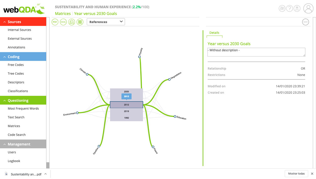
The concept map is dynamic, when a specific reference is selected it provides more information.
The main utility of the concept map is the immediate visualization of interesting ideas for the study in a dynamic way, being able to select the necessary codes and descriptors.
Finally, as noted, the communication of data and results is not only important to achieve them through the use of words, graphic and visual representation offers great opportunities to understand information through the use of diagrams, maps, etc.This possibility is offered by webQDA, favoring the analysis and complete interpretation of the study, thus facilitating the researcher to disseminate the results accessible to readers.
As a final consideration, the most important thing is that the researcher knows and has well defined the objective and the information they want to convey, in order to select the most appropriate visual medium.
References:
Banks, M. (2010). Los datos visuales en Investigación Cualitativa. Morata.
Friel, S. N., Curcio, F. R., & Bright, G. W. (2001). Making sense of graphs: Critical factors influencing comprehension and instructional implications. Journal for Research in Mathematics Education, 32(2), 124-158. https://doi.org/10.2307/749671
Kosslyn, S. M. (2012). Graph Design for the Eye and Mind. https://doi.org/10.1093/acprof:oso/9780195311846.001.0001
Martí, E., & Pozo, J. I. (2000). Más allá de las representaciones mentales: la adquisición de los sistemas externos de representación. Infancia y aprendizaje, 23(90), 11-30.
Pértega, S., & Pita, S. (2001). Representación gráfica en el Análisis de Datos. Investigación: Representación gráfica en el análisis de datos.
Rodrigues, A. I., Costa, A. P., & Moreira, A. (2019). Using CAQDAS in Visual Data Analysis: A Systematic Literature Review. Advances in Intelligent Systems and Computing, 861, 235-247. https://doi.org/10.1007/978-3-030-01406-3_20
Sedrakyan, G., Mannens, E., & Verbert, K. (2019). Guiding the choice of learning dashboard visualizations: Linking dashboard design and data visualization concepts. Journal of Visual Languages and Computing, 50, 19-38. https://doi.org/10.1016/j.jvlc.2018.11.002
Willers, B. (2015). Show, don’t tell. En New Challenges for Data Design (pp. 3-22). https://doi.org/10.1007/978-1-4471-6596-5_1


Leave a comment